


НЕВАГОМІСТЬ
Концепція розробки логотипу та фірмового стилю для бару «Невагомість» у тематиці космосу. Цільовою аудиторією є мешканці та туристи міста, які цікавляться незвичайними тематичними локаціями та хочуть отримати новий досвід. Меню бару — ульотні коктейлі та їжа, натхненні темою космосу.
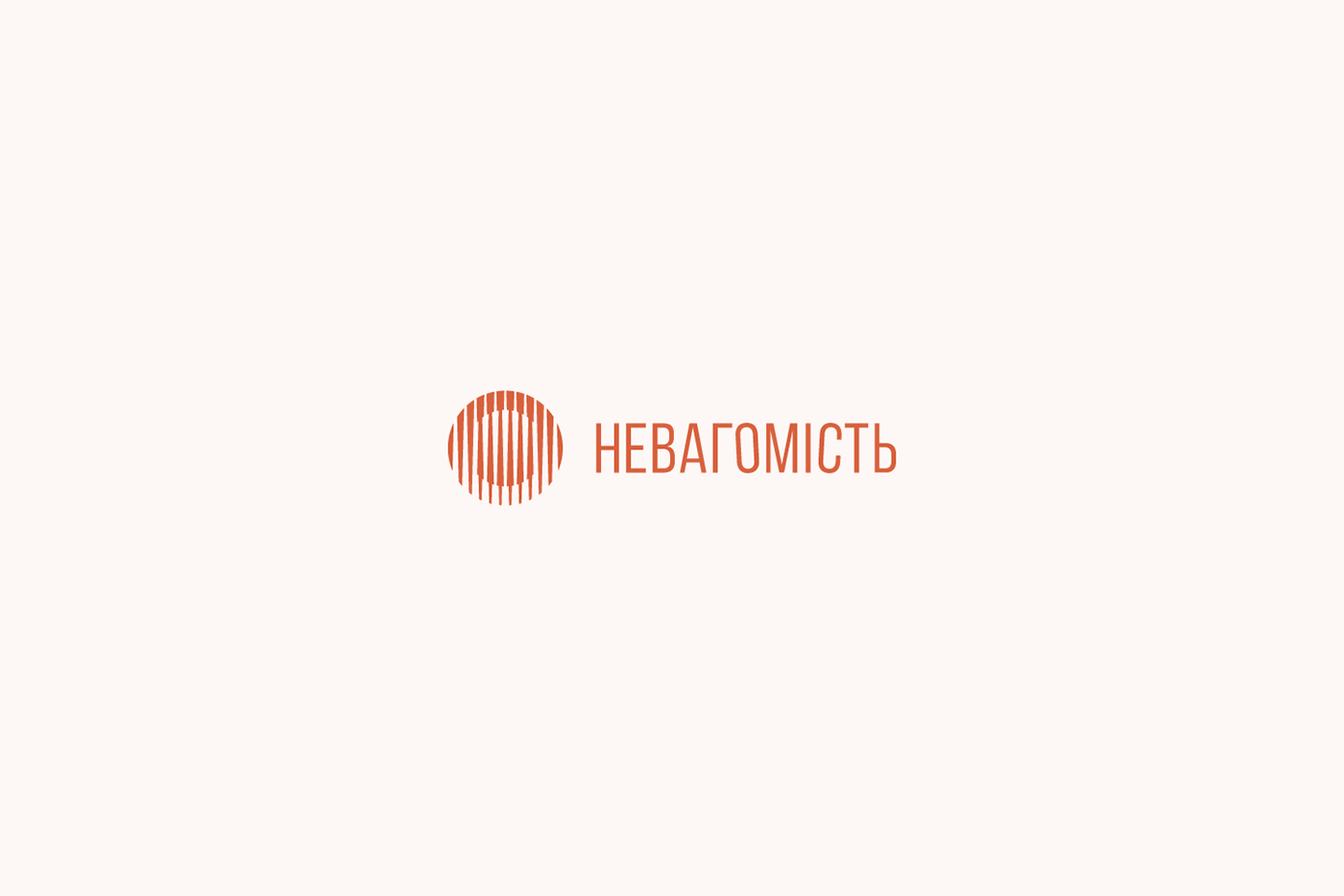
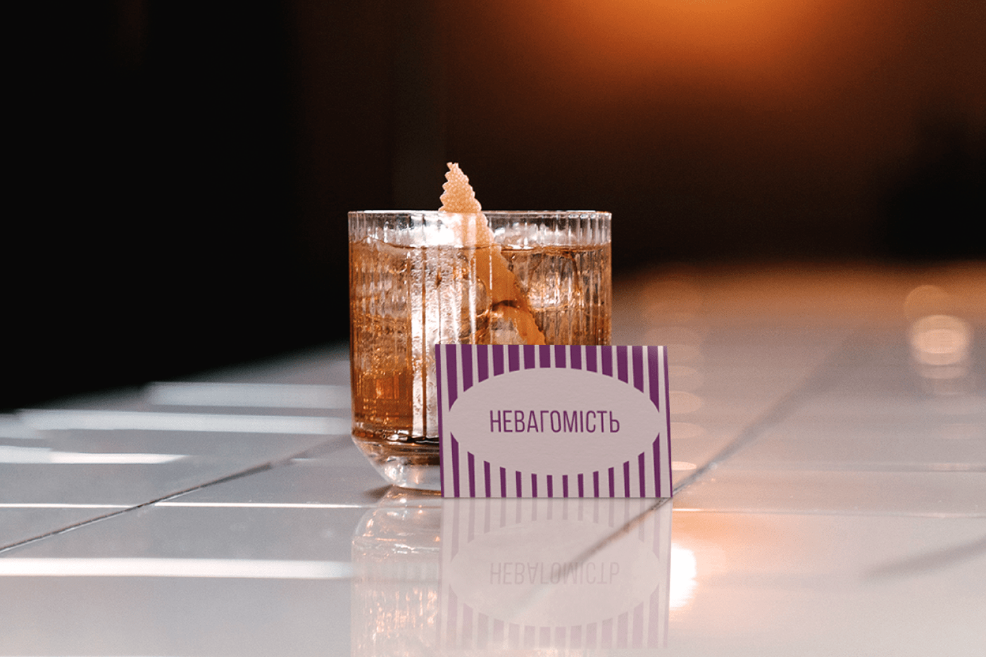
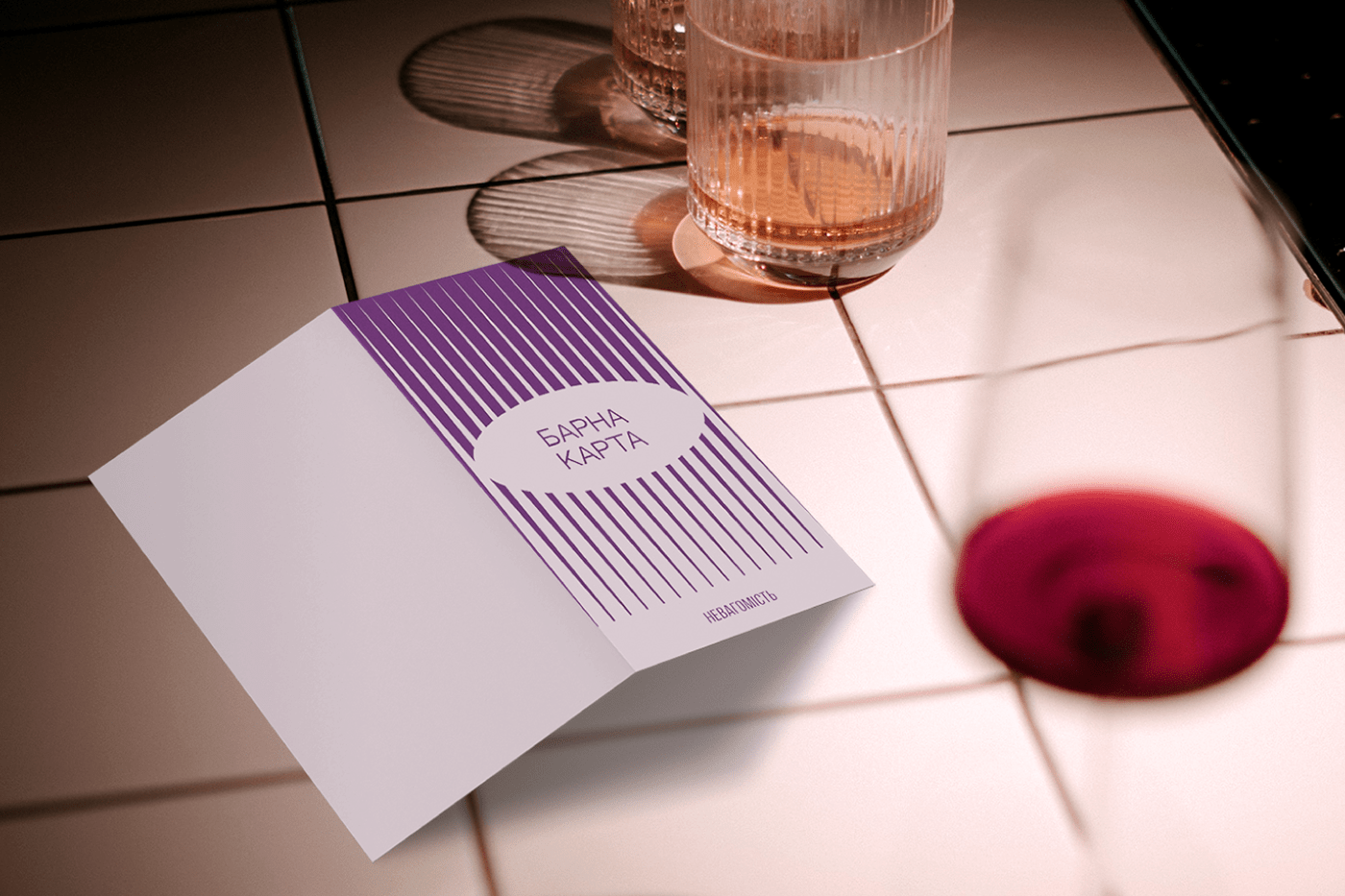
Під час розробки дизайну вирішив відшукати натхнення для метафори із області фізики. В знак логотипу та графічні елементи фірмового стилю була закладена метафора оптичної ілюзії, де уявне коло всередині іншого має інший стан по відношенню до зовнішнього, це відображено за рахунок зміни напрямку потовщень ліній, що формують ці кола. Внутрішнє коло ніби демонструє незалежність від іншого, перебуває у стані невагомості. Окрім цього, кожна лінія є відокремленою одна від одної, що також транслює їх невагомість. Також, я надихнувся естетичними барними ребристими склянками і вирішив втілити це в даній концепції.
В розробленому лого було застосовано витягнутий по висоті шрифт, що гарно доповнює знак, посилює барну естетику, відсилає до модних газет і журналів, і ненав'язливий своєю акциденцією. Округлим літерам заданий кут нахилу для зображення порушення рівноваги.
Використана кольорова гама — теж із області фізики, крайні кольори видимого спектру кольорів обрані з натяком на протилежність станів (тепла та холоду, ваги та її відсутності). Окрім цього, фіолетовий — про романтику космічного простору, помаранчевий — колір Марсу.
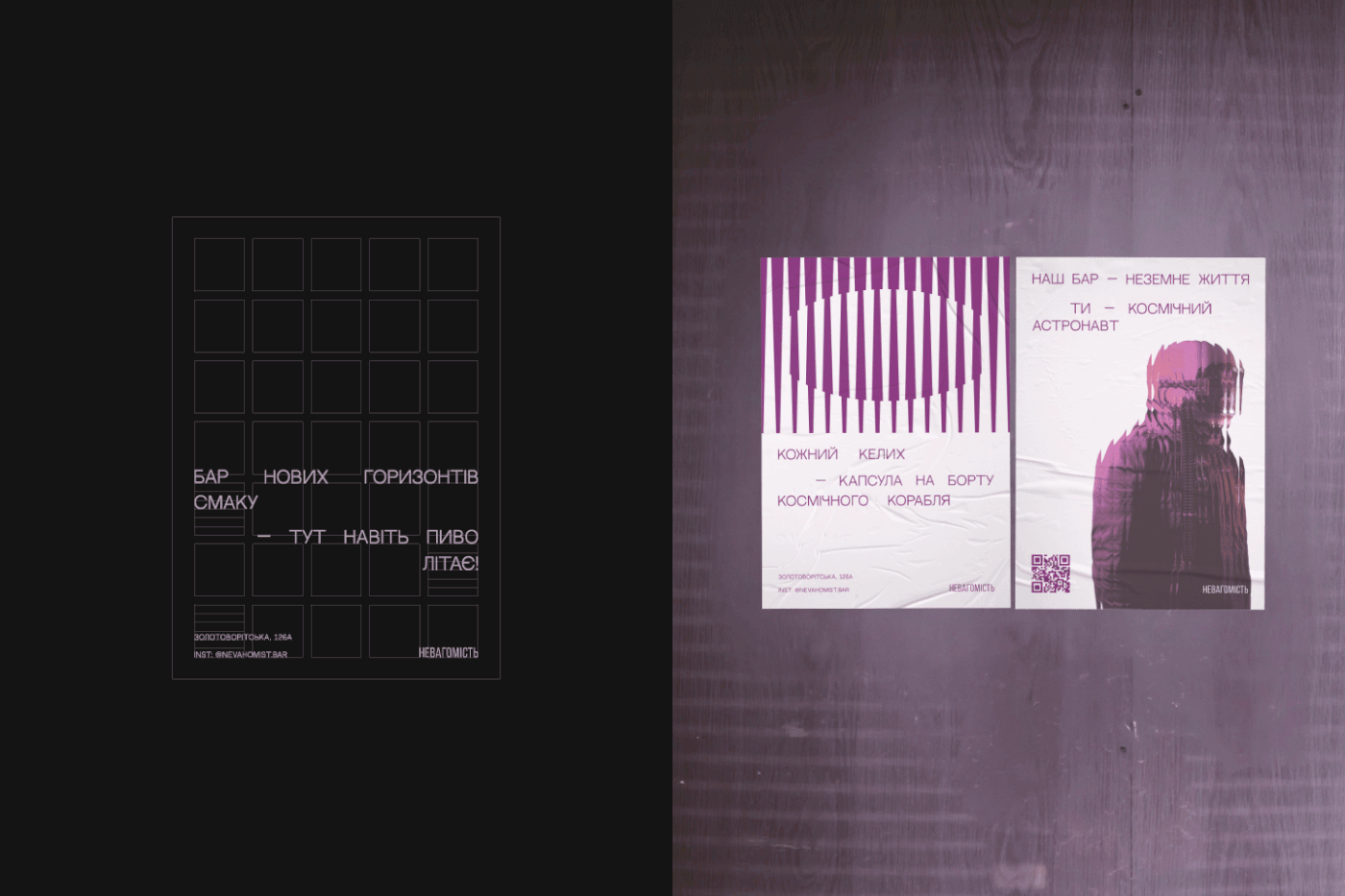
Верстка тексту здійснена з урахуванням сіток, слова рівновіддалені одне від одного по ширині макету, що уособлює невагомість кожного.
The concept of developing a logo and identity for the Nevahomist' (Zero Gravity) bar in the theme of space. The target audience is city residents and tourists who are interested in unusual themed locations and want to get a new experience. The bar's menu includes space-inspired cocktails and food.
During the design process, I decided to find inspiration for the metaphor from the field of physics. The logo mark and graphic elements of the corporate identity were based on the metaphor of an optical illusion, where an imaginary circle inside another has a different state from the outer one, which is reflected by changing the direction of the thickening of the lines that form these circles. The inner circle seems to demonstrate independence from the other, being in a state of weightlessness. In addition, each line is separate from each other, which also conveys their weightlessness. Also, I was inspired by aesthetic ribbed bar glasses and decided to embody it in this concept.
In the developed logo was used an elongated font, which well complements the mark, enhances the bar aesthetics, refers to fashion newspapers and magazines, and is unobtrusive with its action. The rounded letters are set at an angle to depict an imbalance.
The color scheme used is also from the field of physics: the extreme colors of the visible color spectrum were chosen with a hint of opposite states (heat and cold, weight and lack of it). In addition, purple is about the romance of outer space, and orange is the color of Mars.
The text layout is based on grids, the words are equidistant from each other along the width of the layout, which embodies the weightlessness of each.
Designer: Andrii Vorvykhvost
Open to new projects :)


